AustralianMoto Spares
Australia's Home of Motorcycle Parts & Accessories
A clearer retail experience for riders and mechanics who want to find the right part quickly, trust what they see, and complete the order without friction.
Experience focus
Built for fast product decisions
The challenge
The store had to feel less like a catalog and more like a confident buying assistant.
We focused on the friction points that matter most in a parts marketplace: discovery, stock confidence, and a purchase path that does not get in the way.
Search fatigue
Customers were forced to scan too many paths before landing on the right part or accessory.
Unclear availability
Stock confidence needed to be visible earlier so users could buy without second-guessing.
Clunky checkout
The final purchase step had to feel lighter for repeat buyers and first-time shoppers alike.
The solution
A cleaner purchasing system designed around intent, clarity, and speed.
The interface was restructured so the most important actions sit closer to the user, making the product feel more focused and credible.
Checkout simplification
The goal was not just to reduce clicks, but to make each step feel clearer and more reassuring.
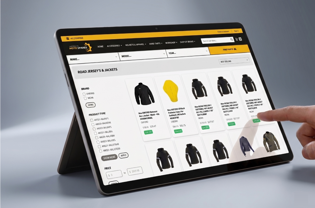
Fitment-first browsing
Search and filtering were organized around make, model, and year, helping users move from intent to product faster.
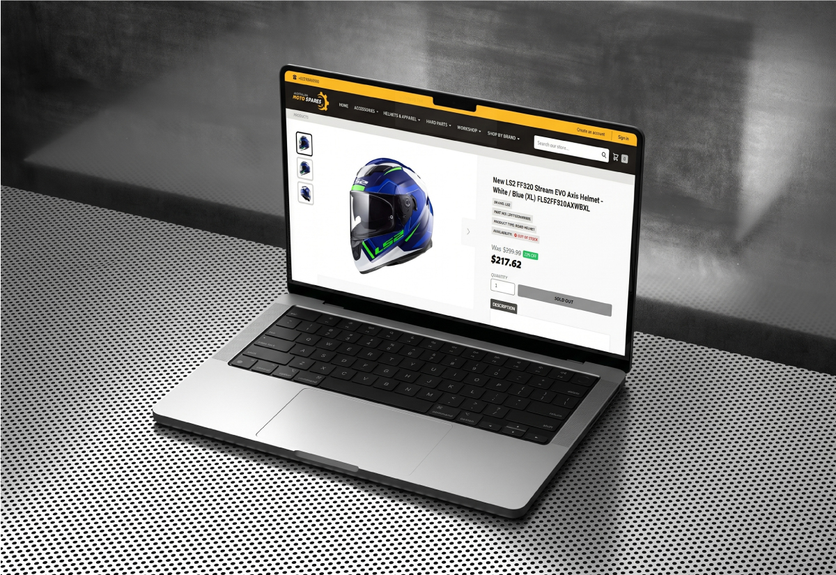
Live stock confidence
Product state, low-stock cues, and stock visibility were designed to make decisions feel safer before checkout.
Lower-friction checkout
A shorter path with guest purchase support keeps the buying moment focused and easy to finish.
Interface preview
Designed for speed and clarity
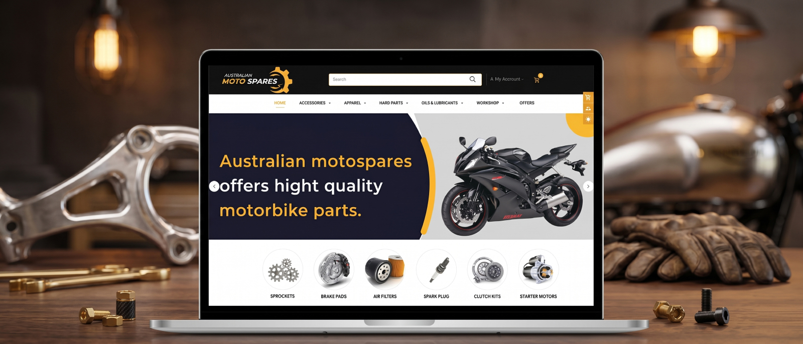
Transforming parts discovery with fitment-first browsing
Feature set
Designed as a premium commerce experience, not just a product list.
The storefront now supports a broader parts catalog, cleaner internal management, and a mobile shopping flow that feels easier to trust.
Catalog built for depth
The store can support a broad parts range without making navigation feel heavy or confusing.
Operational tools that scale
Order, stock, and catalog management sit behind a cleaner interface for the internal team.
Mobile buying made practical
Touch targets, spacing, and hierarchy were tuned so riders can shop comfortably from smaller screens.
Trust built into the UI
The design prioritizes clarity and consistency so the storefront feels more credible at every step.
Delivery process
A focused process that keeps the experience clear from the first search to the final click.
The process follows the parts-buying path from vehicle search to checkout, which makes the journey easier to understand on any screen size.
Map the buying journey
We traced where users hesitated, where they switched devices, and where product choice started to break down.
Rebuild the hierarchy
The layout was rebalanced so search, stock, and purchase actions appear in the right order.
Refine the experience
Supporting interactions were tightened to keep the page smooth on desktop, tablet, and mobile.
Impact delivered
Cleaner discovery, stronger conversion signals, and a more professional retail presence.
The final experience feels calmer, faster, and easier to trust, which is exactly what a parts marketplace needs when a purchase is important.